Creating a Page (Screen)
Creating a page (or screen) consists of four sections:
- Basic data
- Categories
- Attributes
- Blocks
- Forms
1. Basic Data
The "Basic data" tab contains three sections:
-
Types of pages - this refers to the type of page (or screen) being created. The following types are available:
- Common pages - a type for regular pages (or screens), such as home or about;
- Catalog pages - a type for pages (or screens) that will contain a catalog, such as products or multimedia items;
- Error pages - a type for pages (or screens) that display errors. The error code must be linked in the Additional settings;
- External page — a type for creating a link to an external website. In the Page URL field, you can specify any external URL (for example,
https://example.com).
For such pages, blocks and forms are not available — they do not appear in the editor.
This type is used in the menu as an external link (for example, to a corporate website, social media, or partner resources).
-
Details contains three input fields: "Page title" - the title of the page (or screen), "Page URL" - a unique identifier that will be used to call the page (or screen) later, and "Name of the menu item for the page" - this is the name of the page (or screen) that will be displayed in the "Menu". The "Menu" block is described in the following chapters
-
Editor - this block allows you to add the actual content for the page (or screen). You have the option to use two types of editors: text and markdown.
By default, the text editor is selected; to use markdown formatting, select:

Or to switch to plain text mode without formatting, select:
The editor also has the option to optimize uploaded images, which is enabled by default. There is also a checkbox for this:

Documentation for the text editor is described here. For markdown - here.
2. Categories
The "Categories" tab is necessary for creating a hierarchical system within the application and establishing parent-child relationships between pages (or screens).
For example, for the page (or screen) demo, the following hierarchy is created: "catalog" -> "shop" -> "demo"
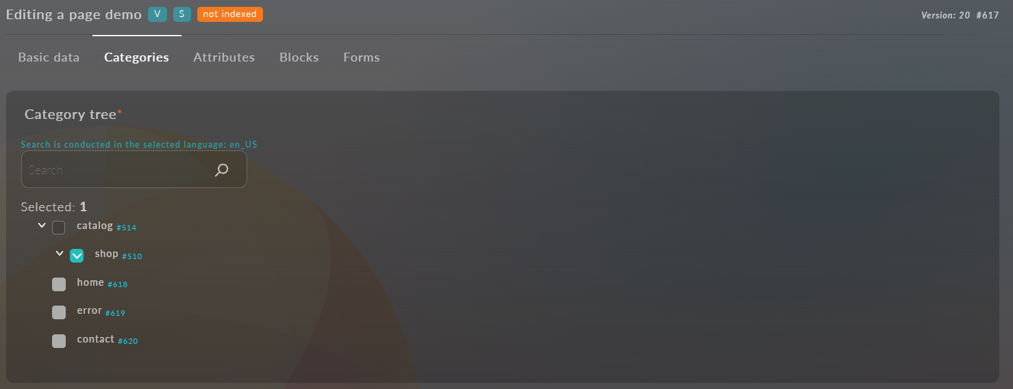
You can also see the hierarchy on the main screen of the "Pages" module, where a list of all created pages (or screens) is presented. In this list, you can also manage the hierarchy by dragging pages (or screens) in the table.
3. Attributes
The "Attributes" tab contains two dropdown lists for selecting Templates and Attribute Sets. "Attributes" is a fundamental concept of Platform OneEntry, which is described in detail in the following chapters.
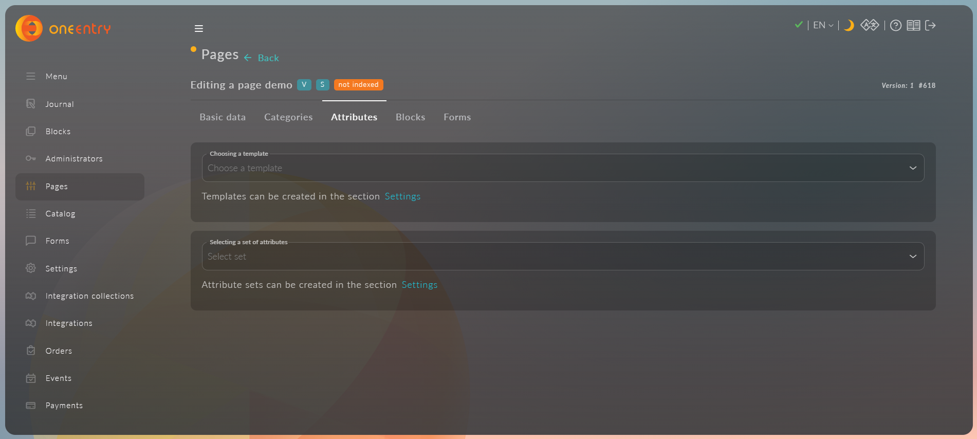
After selecting an attribute set, you need to fill in the values. In our case, these are:
- The attribute "title," which has the type "Text with Header." We will specify "Some example title" as the value; there is also a field for text that will be displayed in case of an error, which we will set to "example error message";
- A field for uploading an image (img). We will upload the OneEntry logo here. We also have the option to optimize the uploaded image by clicking on "Optimize uploaded images" and change the image parameters directly in Platform OneEntry;
- A field for integer values "something_integer." We will add a value equal to "2024".
4. Blocks
The "Blocks" tab contains a dropdown list for selecting blocks and a list of selected blocks. Blocks can be moved (sorted) just like pages (or screens). There is also an action column for each block:
 Configure
 Delete
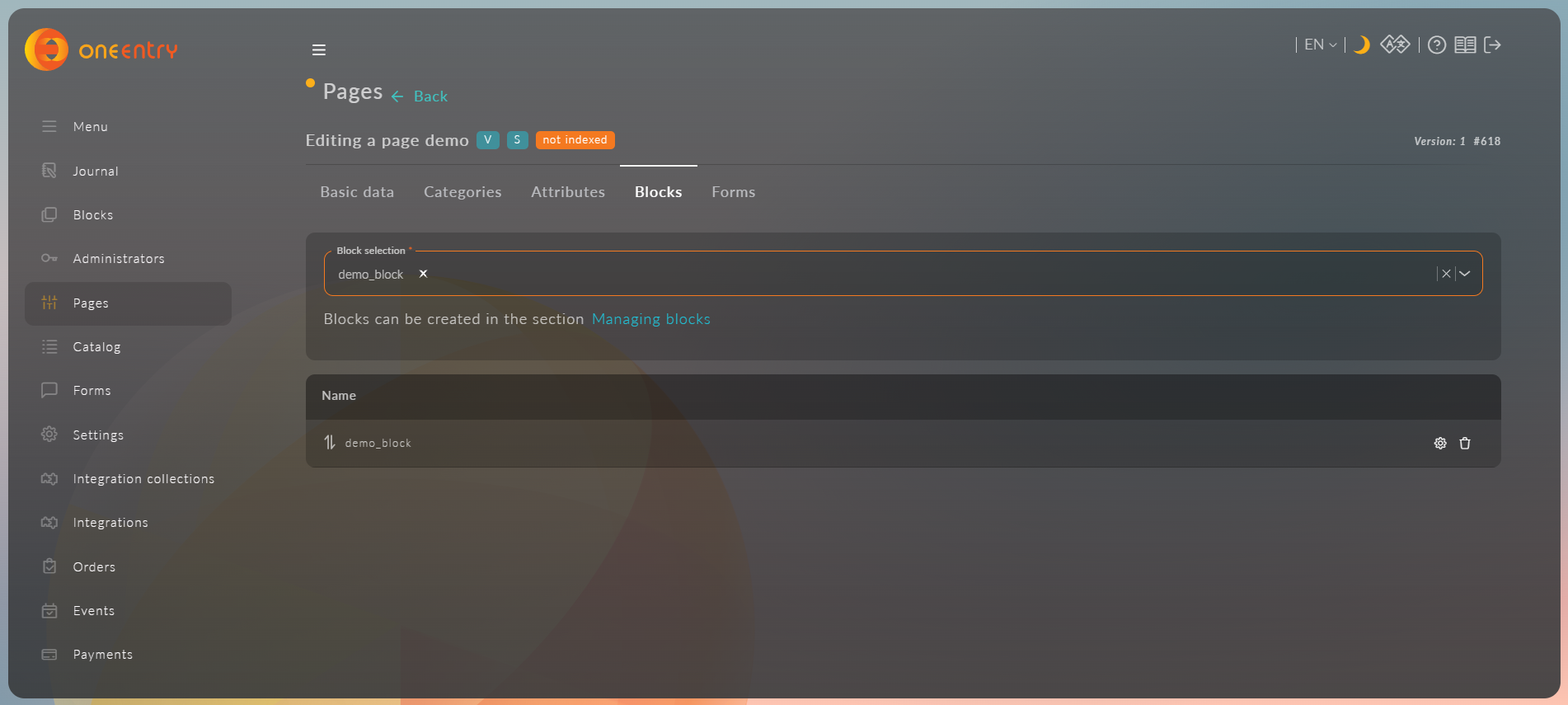
For a catalog page, you can attach any set of blocks as a template for new products.
To do this, in the selection "Product blocks that are attached to all child products," you need to select the created blocks.
Now, a new product on this page will be created with the specified set of blocks:
We will discuss blocks in detail in the following chapters
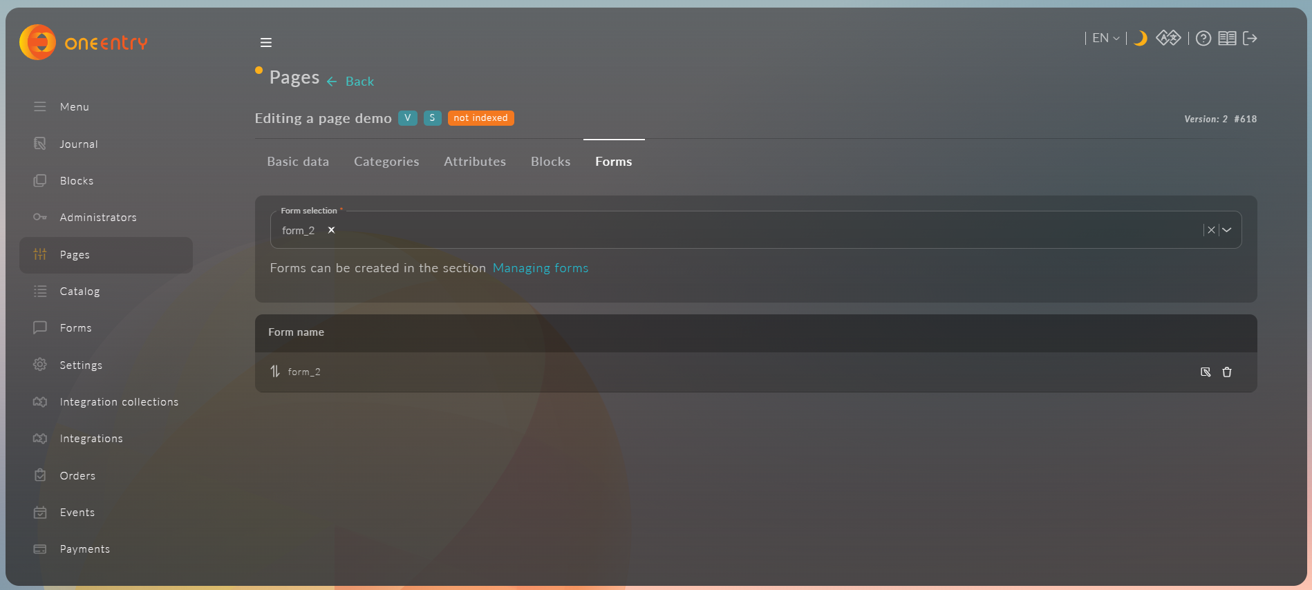
5. Forms
The "Forms" tab contains a dropdown list for selecting forms and a list of selected forms. Forms can be moved (sorted) just like pages (or screens). There is also an action column for each form:
 Edit
Edit
Delete
We will discuss forms in detail in the following chapters